Windy.app new website! This is what has changed
There is a new website of Windy.app — big news for all the team, users, and outdoors fans all over the world.
In case you have forgotten how the old version looked like, read to the end of this news.
What has changed
1. Light Theme
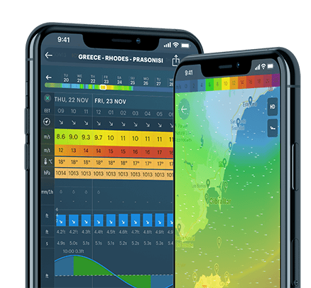
The website is now mostly light (white) — just like the Light Theme of the app. (Yes, you can change the standard dark blue app theme to white.) It's better and easier to read the text and view the wind map in white.

Light theme in the app:
2. Live Wind Map location
The wind map is now on a separate page, bookmark the link: https://windy.app/map.
You can open it from the main menu or the home page. And, of course, you can find Wind Map on the particular spot page.
In the latter two cases, the map zooms to full screen — no need to go to spots pages, if you don't need the spot:

3. Spot search location
The Spots Search Bar is now located at the very beginning of the home page. Finding a spot is now easier and faster — no need to go to the Spots section also to find a bar.
4. Windy.app welcome video
Don't like or don't have time to read, but what to know what is Windy.app? We recorded a short video about the app for the site update for the new users. Now it will always be on the same home page. At the same time, we got a YouTube channel! Soon we will have more information there.
5. Sections layout
All the main sections like News, Guide, Blog and others, where we publish useful and interesting content to you, now look new. Searching for publications also became faster and easier.
By the way, here's the latest news, post, and guide — they will be useful for all kite- and windsurfing fans:
- Find the wind speed and direction on the Home screen
- The Сollection of Articles About Kitesurfing, Kiteboarding and Windsurfing in 2020-21
- Mini Guide to Windsurfing in Windy.app
***
This is just the first version of the new Windy.app website. We will continue to update it and improve it.
Write any thoughts you have about it to [email protected]: what you are missing, what you want to remove, what you like, what you maybe don't...
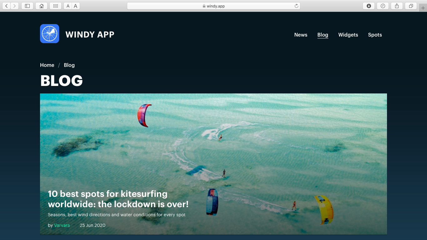
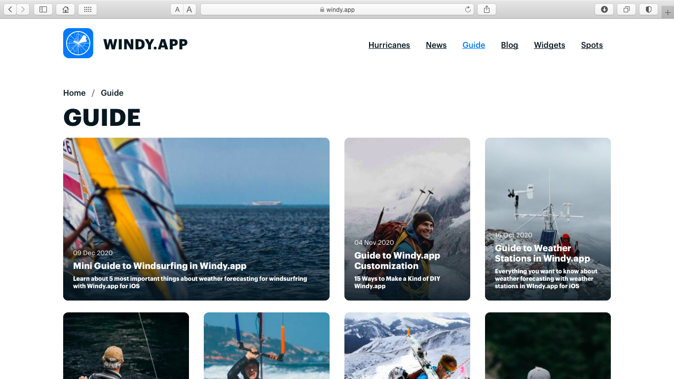
And the old version looked like this:
Get more news and updates in Windy.app News
Related News
Professional Weather App
Get a detailed online 10 day weather forecast, live worldwide wind map and local weather reports from the most accurate weather models.
Compare spot conditions, ask locals in the app chat, discover meteo lessons, and share your experience in our Windy.app Community.
Be sure with Windy.app.


