Aerological Diagram — complex, but incredibly useful tool for weather forecasting at different heights
Professional meteorologists have a huge variety of tools to forecast weather. Some of them you have never even heard of — for example, an aerological diagram.
You're right, the name seems complicated: It is one of the most difficult meteorological tools used to predict the weather at different altitudes. However, reading it correctly could help everyone prepare for the upcoming weather while doing your favorite sports and outdoor activities in the air such as paragliding, light aviation, aeronautics, and so on.
In this article, we will understand what an aerological diagram is and how to read it correctly.
What is an aerological diagram? Is it the same as the Skew-T log-P diagram?
Yes, it is the same. The aerological diagram is a thermodynamic chart that displays data on air at different altitudes. (A normal weather forecast is made for the nearest surfaces above the ground, for example, the wind is always predicted at 10 meters.)
In particular, the diagram depicts air temperature, dew point, and wind.
This diagram is also called Skew-t log-P diagram, where "Skew-T" comes from the fact that the temperature lines on the diagram from 1947 are skewed at a 45 degrees angle, and the “log-P” represents the “logarithm of the pressure”, which shows how the atmospheric pressure decreases with increasing altitude.
Using the mentioned parameters, meteorologists get information on the weather conditions of the upper air. Thus they can learn the stability in the atmosphere, see all the weather parameters at every air layer and use it to produce synoptic scale, forecast models. This сhart can also be used to learn about possible severe weather.
In everyday use, the Skew-t log-P diagram may be used by paragliders, plane and drone pilots, balloonists, and other fans of active recreation in the air.

John O Nolan / Unsplash
How to read the aerological diagram and forecast the weather with it?
Reading the diagram could be a little complicated, but when you practice a bit, this will be like a walk in a (national) park to you. There are several important things you can see on the diagram: coordinate system, temperature gradient, curves, wind barbs, and two indices. Let's deal with everything in order:
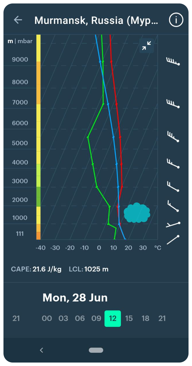
Aerological Diagram or Skew-T log-P Diagram using to forecast clouds in Murmansk, Russia, in the Windy.app for Andoid
Coordinate system
The diagram has an angle coordinate system with vertical height / atmospheric pressure and horizontal temperature.
The diagram is available in two variants:
- up to 250 millibars, unit of air pressure in the metric system (approximately 10 km / 6.2 mi),
- and up to 600 millibar (about 4 km / 2.4 mi), to allow you to have a more detailed examination of the lower troposphere — the lowest layer of Earth's atmosphere (average height is 13 km / 8.1 mi / 43,000 ft.)
Temperature gradient
Temperature gradient indicates temperature change with height (ºC / 100 m (238 ft)).
Curves
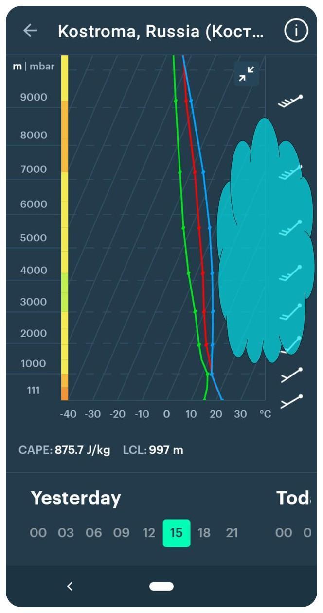
In this diagram, there are three curves on the chart:
- The red curve is the atmospheric stratification curve. It shows the temperature of the air at different altitudes and makes it possible to assess the stability of the atmosphere, the existence of inversions, and the possibility of convection.
- The green curve is the depegram or dew point curve. It shows the humidity of the air at different altitudes. The closer the depegram is to the stratification curve, the higher the humidity and the greater the probability of cloudiness and precipitation. If, on the contrary, the depegram deviates from the stratification curve by tens of degrees, then at this height it will be clear.
- The blue curve is the air parcel (a very small amount of fluid) path. It is calculated from the air temperature at the surface. It shows how the volume of air that rises from the surface will behave. If the parcel path is to the right of the stratification curve, convection will develop.
Using one, two, or all three curves, you can not only learn about the weather data but also forecast it yourself. For example, the closer the green curve is to the red one, the higher the humidity and the greater the probability of cloudiness and precipitation are. And vice-versa.
Aerological Diagram or Skew-T log-P diagram using to forecast clouds in Murmansk, Russia, in the Windy.app for Android
Wind barbs
The wind bards, the arrows with the feathers, show the speed and direction of the wind. This is how the wind was depicted on paper maps before the advent of interactive maps. The direction of the arrow indicates where the wind is blowing from, and the size and number of feathers indicate the speed of the wind in knots.
Learn how to read wind barbs in the Windy.app blog.
Indices
On the diagram you will also find two indices:
LCL is Lifted Condensation Level or the height at which the relative humidity of an air parcel reaches 100% with respect to liquid water when it is cooled by dry lifting. It is a good approximation of a simpler concept of the cloud base or the height of the lower boundary of cloudiness (if cloudy).
Learn more about cloud base in the Windy.app blog.
CAPE Index stands for Convective Available Potential Energy. The index reflects the presence in the atmosphere of a certain amount of energy that can be used for convection. In other words, it is an indicator of atmospheric instability, which can lead to showers, thunderstorms, and squalls.
The index is measured in J/kg (joules/kilogram). For example, <0 J/kg — stable state: no cumulus or cumulonimbus clouds, heavy rainfall, thunderstorms, etc. But ≥ 3500 J/kg — is very high instability: heavy and very heavy thunderstorms, tornados.
So the higher its value, the more unstable the atmosphere (i.e., the temperature of the air changes more with height).
Learn how to read CAPE Index in the Windy.app blog.
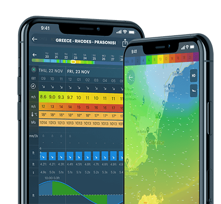
Where to find the aerological diagram or Skew-T log-P diagram in the Windy.app?
You can find an aerological diagram in the spot screen menu in the Windy.app version for Android.
Here are a few more examples of how to use the diagram for cumulus clouds and fog forecasting in the Windy.app Meteorological Textbook.
You can also find CAPE Index as a single index in the Air Weather Profile in the Windy.app for both Android and iOS.
Read Mini guide to paragliding with Windy.app.
Text: Katerina Melnik, Ilia Ponomarev, Ivan Kuznetsov and the Windy.app team
Cover photo: Kevin Wolf / Unsplash
You may also find useful other complex forecasting tools in the Windy.app
Latest News
Professional Weather App
Get a detailed online 10 day weather forecast, live worldwide wind map and local weather reports from the most accurate weather models.
Compare spot conditions, ask locals in the app chat, discover meteo lessons, and share your experience in our Windy.app Community.
Be sure with Windy.app.