Contour lines — a useful tool for better weather forecasting
Contour lines are the lines on a map, chart, or graph that connect points with the same value.
Contour lines are also often called isolines or isometric lines. They have many other names: isopleths, isarithms, isograms — but all these are also isolines in a general and broad sense. “Iso” (ισος) is an Ancient Greek word meaning “equal”.
In this article, we will learn more about what contour lines are and why we need them, as well as about the history of their usage by people.
What are contour lines?
The easiest way to explain what isolines are is to use an ordinary topographic map, which you have definitely held in your hands at least once in your life during a hike in the mountains. So you have already seen isolines, you just might not have known about it.
On this map, these lines connect points with the same height and thus show all the features of the terrain — mountain peaks, slopes, and hills, passes, and valleys. So, this is the very first and basic type of isoline, which is called isohypse.
In total there are more than 20–30 basic types of isolines. We will deal with all of them in the second part of this article.
As you see, contour lines are needed because they help you understand the relationship between the geography of a particular area and the exact data. The data could be collected on the ground, in the ocean, or in the atmosphere — for example, about the weather.
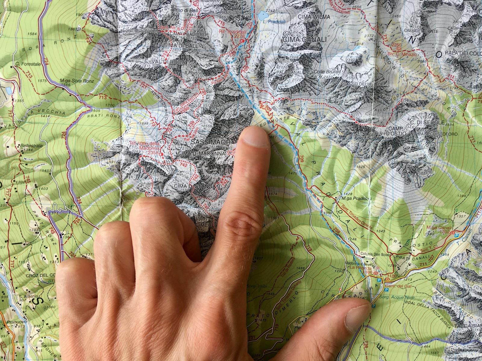
Counter lines on topographic map of the Pale di San Martino mountains, Dolomites, Italy / Ivan Kuznetsov
How did people invent contour lines and start using them on weather maps?
Isolines, as a system for indicating the same values on maps, were first invented precisely to convey the features of the relief in the 16th century, so they are still associated with geographical maps in the first place. And such maps themselves became known as isoline maps.
It is believed that the first isohypse was used to describe a land surface in a map of the Duchy of Modena and Reggio, a small state that existed from 1452 to 1859 in Northern Italy, by Domenico Vandelli, a local Italian cartographer, scientist, and mathematician, in 1746 (if you google him, there was naturalist with the same name).
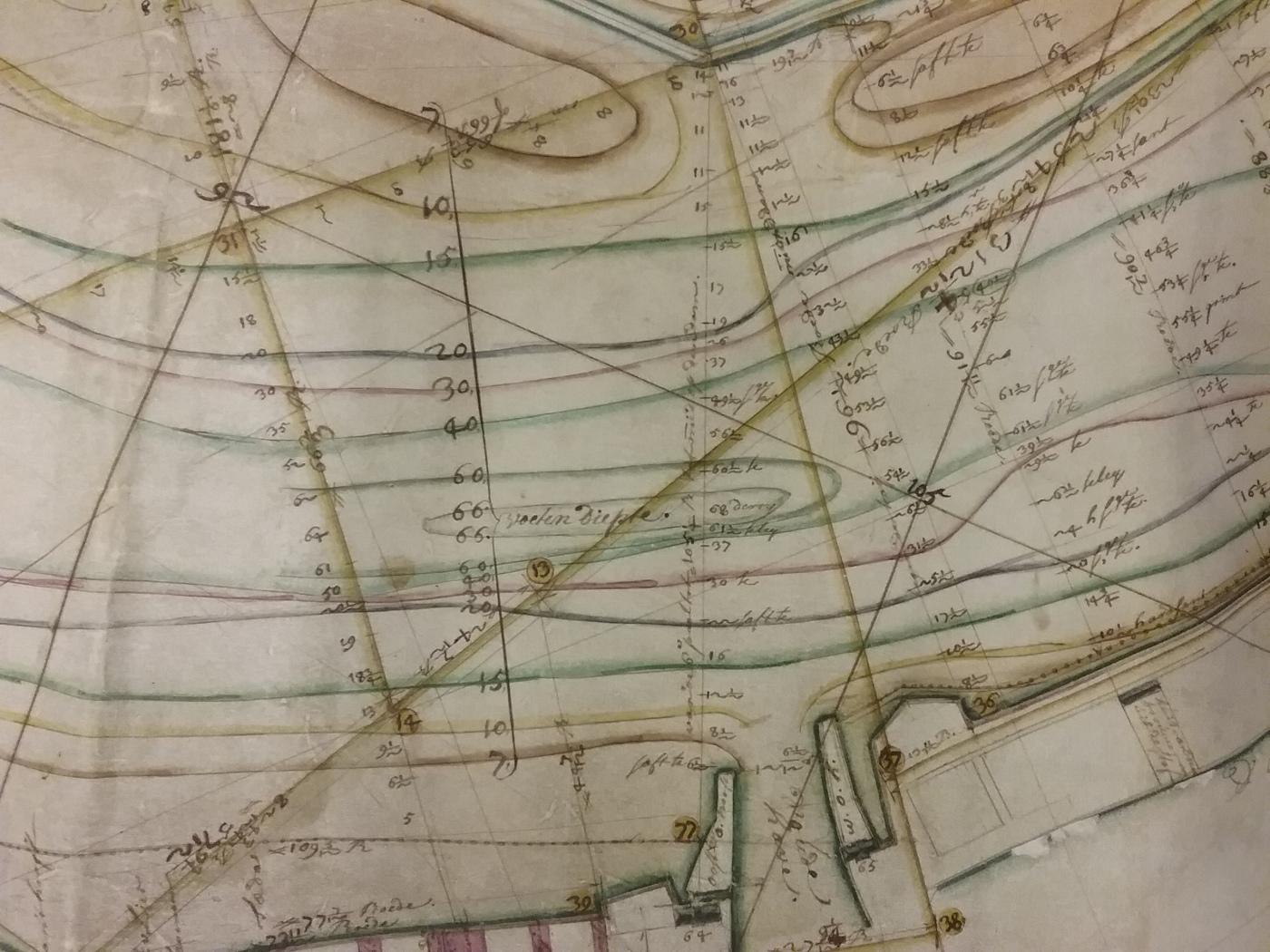
But as human activity was always connected to water, isobath is the second oldest type of contour line. Actually, it was used before isohypse:
The very first known isobath was placed on a map of the Spaarne River in the city of Haarlem in North Holland, in 1584, by Dutch scientist Pieter Bruinsz. Here's this amazing map, where the dotted line shows water “deeper than”:
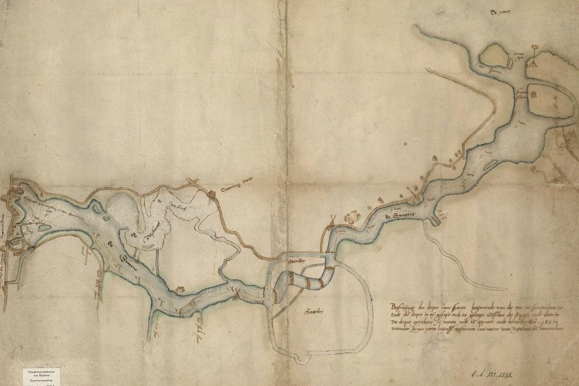
First isobath on the map of the Spaarne River, North Holland / Hoogheemraadschap van Rijnland
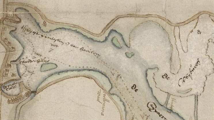
Pieter Bruinsz isolines map / Hoogheemraadschap van Rijnland
However, not everybody considers this counter line the first isoline because it is very simple.
Next time we find this isobaths only more than a hundred years later in 1697 by Pierre Ancellin, also a Dutch scientist, who made the first real isobath map, which depicts a section of the Meuse River — a major river in Europe flowing through France, Belgium, and the Netherlands into the North Sea.

Pierre Ancellin isolines map / Stadsarchief Rotterdam
Isolines on Pierre Ancellin map / Stadsarchief Rotterdam
After another thirty years, another Dutch surveyor, cartographer, astronomer and weatherman, Nicholas Cruquius (Nicolaas Kruik), also drew the Merwede River bottom, which flows between the cities of Woudrichem, Dordrecht, and Papendrecht with isolines in 1727.

Part of Nicolas Cruquius isolines map / Leiden University
Did you notice a thing that they were all from Netherlands? It means that the contour lines for relief were invented in the “flattest country in the world”, as the Netherlands are also called because there is only plain and no hills.
Then, after the Dutch, British national mapping services began to depict counter lines. By 1843, they became very common in almost all European countries.
Isolines on weather maps
Once people began to use isolines on geographical maps to indicate topography, they realized that it was very convenient. After all, how else would we know the height above sea level on a flat map or the depth of some river or lake? So they began using this system to mark a variety of other values on other maps, including weather maps, which interest us the most.
There are several features of such a maps:
- Meteorological contour lines are based on interpolation of the data received from weather stations, satellites, weather radars, and other tools for weather observation. It is also important to understand that weather stations, in particular, are rarely located exactly on contour lines, so the lines are drawn as close to them as possible.
- Meteorological contour maps could represent different values at a time interval: actual data — real-time weather, summarized data — let's say, for average atmospheric pressure in some area, and predicted data — weather forecast.
- Some maps may also have two or more layers of isolines — for example, isobars (pressure) and isotherms (temperature), to represent the overall weather situation from several weather events.
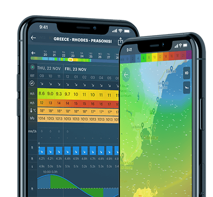
Where to find contour lines in the Windy.app?
In the Windy.app you can find one of the most common types of isolines — isobars, or lines with the same atmospheric pressure, which help to better predict the wind. This can be very useful in addition to the usual weather forecast.
Isobars are available in the app for the whole world at once, which means you are sure to find them in your country, region, and any outdoor spot in it.
To find isobars in Windy.app:
1. Open the Weather Map from the Home screen of the app or the Spot screen.
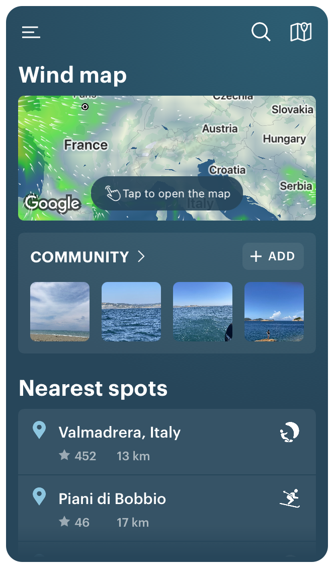
Home screen in the Windy.app for iOS

Halifax spot screen in the Windy.app for iOS
2. Go to Advanced Map Settings clicking on an icon in the lower right corner and select the Atmospheric Fronts and Isobars features layer.

Weather Map in the Windy.app for iOS
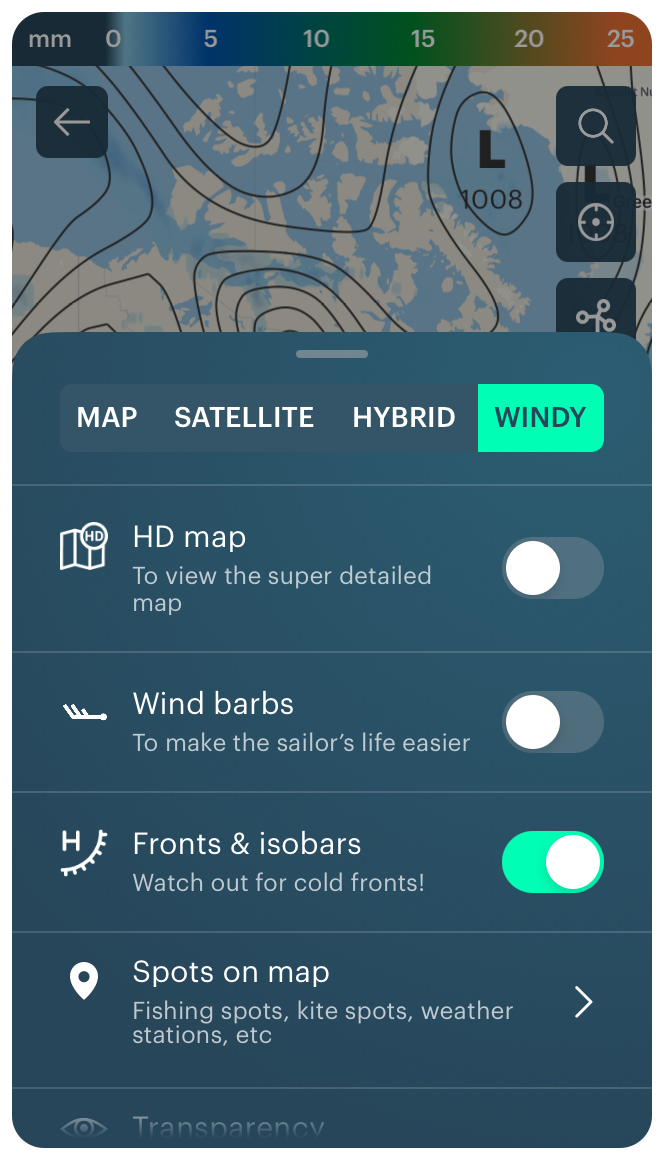
Isobars on the Weather Map in the Windy.app for iOS
3. Return to the map to get the forecast.
For example, north of Halifax, Nova Scotia, Canada, we see a large area of low pressure (L) and many isobar lines around it that are very close to each other — incredible.

Counter lines on the Weather Map in the Windy.app for iOS
By zooming in on the map, you can see the exact pressure values.
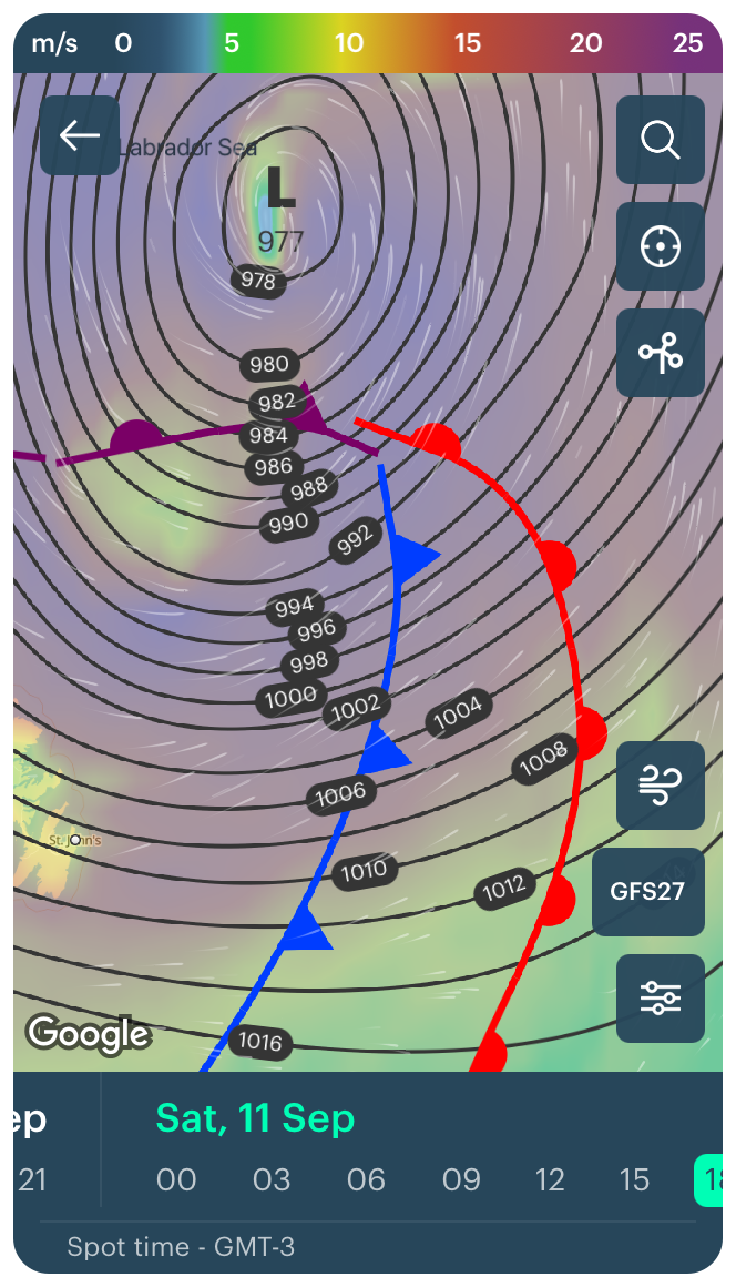
Counter lines on the Weather Map in the Windy.app for iOS
This also tells you that there is a very strong wind here, as evidenced by the color of this area on the map — it is almost purple.
Look at the color scale at the top — the winds are from 20 to 25 meters per second (44.7 miles per hour). This also means a strong / severe gale on the Beaufort scale with high waves of 7–10 m (23–32 ft) at sea, crests roll over. Foam is blown along the wind direction. Large amounts of spray may reduce visibility. On land, roof tiles are blown off buildings.
Learn more about how to read an isobar map in the Windy.app.
Read the second and third parts of this article about the many different types of contour lines and the general rules of reading isolines.
Publish your post in the Windy.app blog and become an expert in our community.
Text: Ivan Kuznetsov, an outdoor journalist, editor and writer from the Dolomites, Italy, and Karelia, Finland, with 10 years of professional experience. His favorite sports are hiking, cycling and sauna. Read his other articles
Cover photo: Ali-kazal / Unsplash
You will also find useful
The basic meteorology for yachtsmen and yachtswomen
How to enjoy hiking in the rain if you never did it
What do weather symbols mean on your favorite app's screen
Latest News
Professional Weather App
Get a detailed online 10 day weather forecast, live worldwide wind map and local weather reports from the most accurate weather models.
Compare spot conditions, ask locals in the app chat, discover meteo lessons, and share your experience in our Windy.app Community.
Be sure with Windy.app.