How to read a weather map like an expert. Wind, precipitation, fronts, more
The weather maps are maps that tell you about the weather. In general, reading and understanding synoptic maps is easy and fun. However, such maps are a bit more complicated than regular geographical maps, and a weather forecast you get in the form of tables, graphs, and numbers. To read such maps you need some knowledge.
In this big guide and instruction, you will learn how to read the very different types of live weather maps.
What is a weather map definition?
A weather forecast map is the same map as a regular geographic map, only instead of countries and cities, or topography, it shows the weather. Often, though, you can still see both countries and cities and landscapes on such a map at the same time.
Weather maps are also called synoptic maps or meteorological maps. So what does a weather map show? They show results of weather observations from weather stations, satellites, weather radars, and other data collection tools located all over the world.
World weather maps are needed in order to understand what the weather is now in a particular region of the earth and what weather to expect in the near future.
In the past, before computers, weather maps were paper maps. Meteorologists around the world used to make them several times a day at intervals of three hours. Three hours is the standard weather forecast step in most weather models. Then, weather forecasts were made on the basis of weather maps.
Wind, temperature, or, for example, the cloud cover in the sky were represented on paper weather maps by special symbols that were quite difficult or even impossible to understand without special knowledge. So many people asked and still ask "What does this symbol indicate on a weather map?"
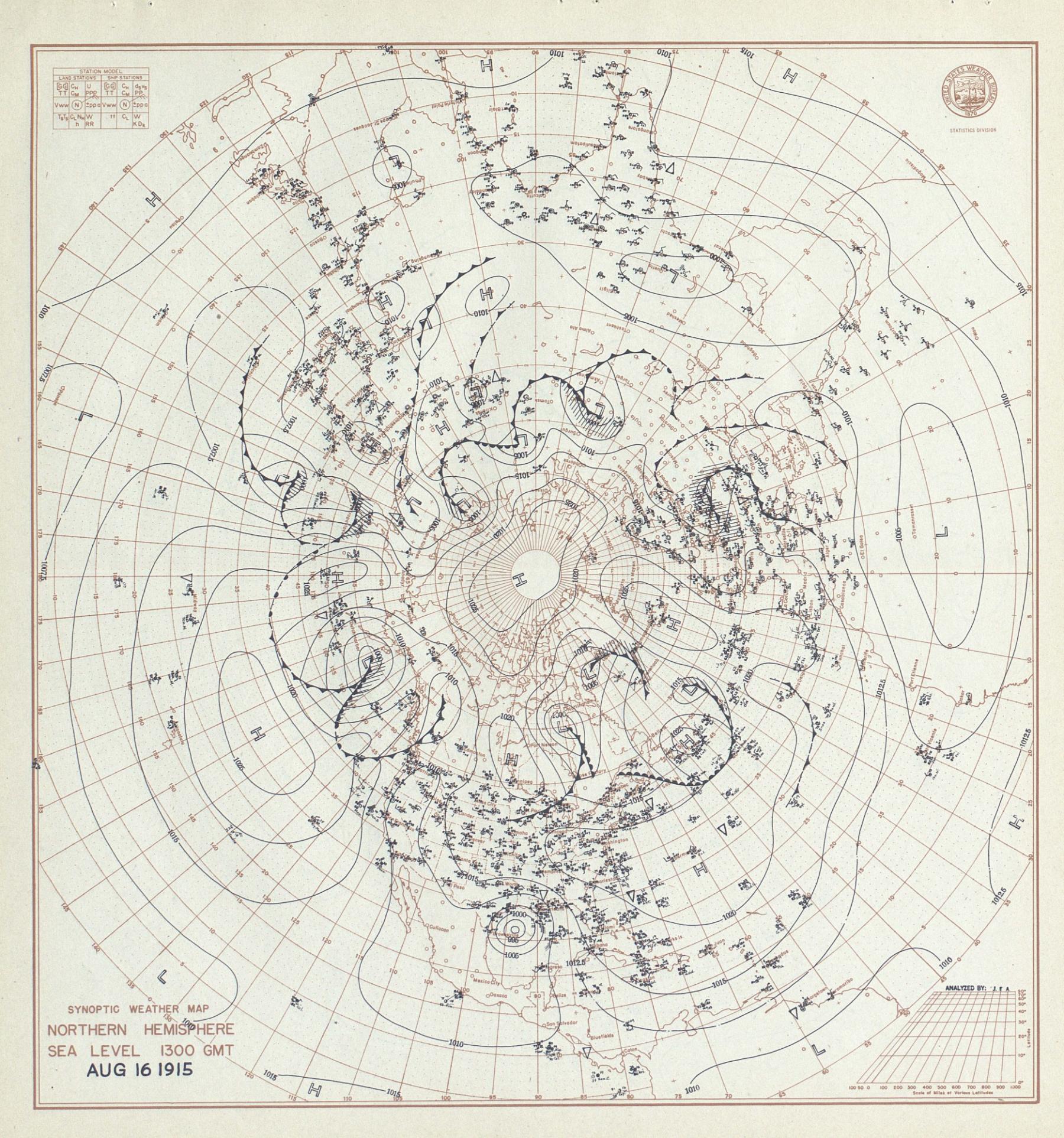
U.S. Weather Bureau Map depicting northern hemisphere circulation patterns on Aug. 16, 1915, as the Galveston hurricane made landfall on the Texas coast. Source: NOAA Physical Sciences Division. Watch larger map
Today, of course, weather maps are digital, just like you have been listening to music in mp3 format for a long time. More: They have become very interactive and live with a lot of visual information. You've definitely seen them on your phone, on websites, or most likely in weather apps by now.
Understanding an interactive live weather map is easier than a paper one. However, it also requires some knowledge.
How to read a weather map like an expert?
To read a map correctly, you need to know a few things:
1. There is no single weather map, there are many, they look different with different information and visualization depending on the source.
2. However, the weather map generally consists of the following basic elements, so keep your attention on them, while reading the map:
- colors,
- special symbols,
- numbers,
- letters or phrases,
- lines,
- different interactive elements.
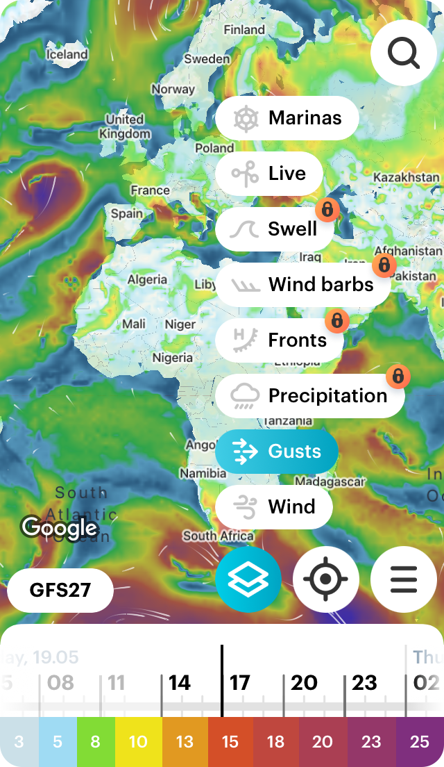
3. Weather maps come in different types depending on the information (weather forecast) that they show. They can be wind maps, precipitation maps, temperature maps, and many others.
4. The data you see on a typical weather map is a forecast for today and, most often, the next 3–10 days from one of the several weather models, which, in turn, could be of one of the two main types: global with a forecast for the whole world and regional or local with a forecast for only some part of the world. For example, it could be a wind map for North America, Mediterranean Sea cost and the like.
5. The map can also have some background — for example, where you can choose a regular or satellite map, or both. There can be more or less information on it. Usually, Google Maps, Apple Maps, OpenStreetMap, and other sources of maps are used as a basis for weather maps.
So, let's figure out how to read many different kinds of weather maps using the Windy.app as an example.
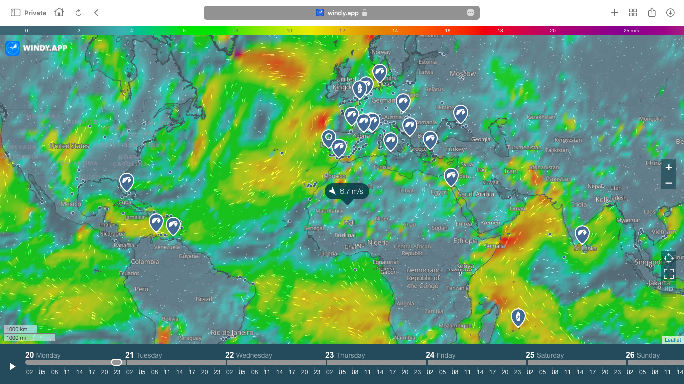
Live wind map on the Windy.app site
Live wind map
This is an interactive wind map that shows what wind is blowing around the world right now and gives a wind forecast for the next 10 days from one of the several weather models.
On the map you see small white dots that look like waves — this is an example of an interactive element that you can use to roughly understand the wind direction, i.e. where the wind is blowing from. Yes, FROM (not to where) is the direction of the wind. So this is how is wind direction indicated on a weather map.
To understand exactly where the wind is blowing at a particular point on the map, click on an individual outdoor spot or any place on the map. You will see a screen with wind direction and speed.
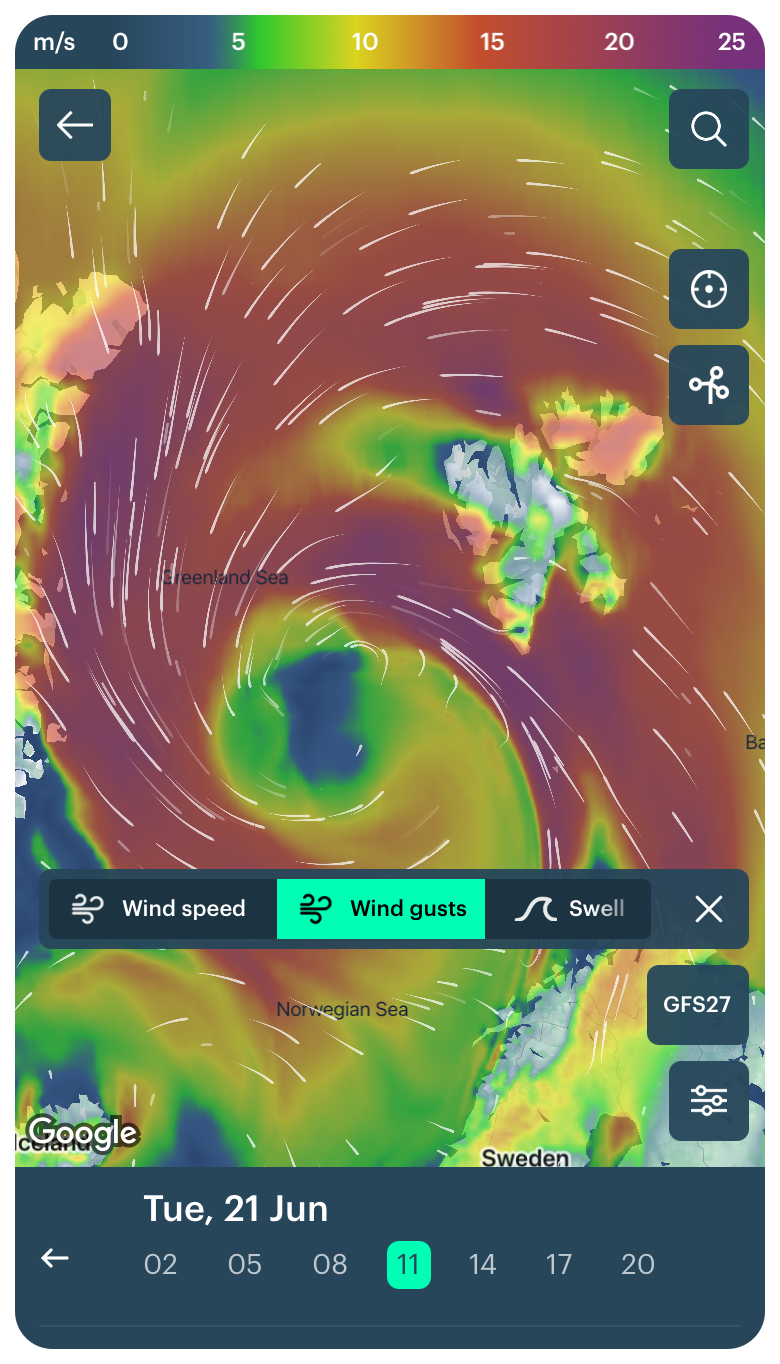
The map is colored in different colors — from blue (no wind) to purple (hurricane wind). In the Windy.app you can change these colors to any other colors by your choice. The colors show you wind speed or gusts (short-term wind increase up to 20–30 seconds). To see the speed or gusts, switch the map layer in the Settings to "Wind" and "Gusts", respectively.
Finally about the wind live map, to find out what the wind will be in a particular region or spot, zoom in and zoom out the map.
Learn more about how to read a wind map
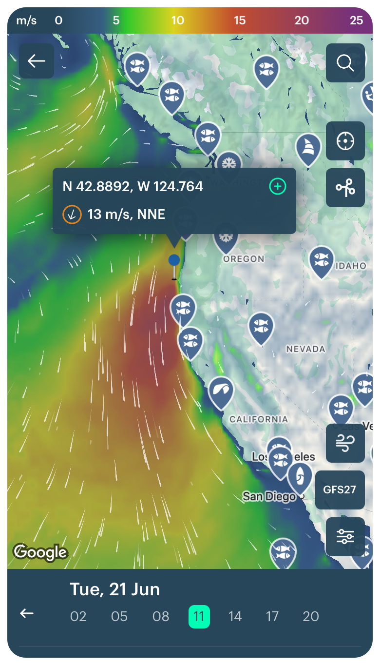
Live wind map in the Windy.app for iOS
Live precipitation map
The precipitation map is the same live map as the wind map, only it shows the amount of precipitation (rain and snow) in real-time and gives a forecast.
The map literally shows you where in the world it's raining now or where it will be raining in the next 10 days. Yes, there are longer precipitation forecasts, but 10 days is a certain limit to the quality of the forecast.
The colors of the precipitation map are about the same, from blue to magenta, but the units are different. Here it is millimeters. You can also change the units to inches to your liking.
Accumulated precipitation is an additional layer that shows the precipitation over a certain period of time in the past and gives a forecast for the same time in the future: 12 hours, 24 hours, three days, five days, and 10 days. I.e. how much it has been or will be raining somewhere. This parameter gives you an overview of precipitation in a particular region and the world in general.
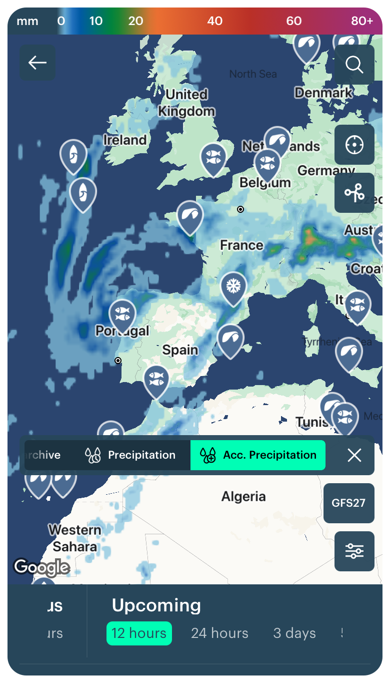
Precipitation map in the Windy.app for iOS
Learn more about how to read a precipitation map
Live weather fronts map
This map shows weather fronts or places where air masses collide in the earth's atmosphere, which differ in temperature, humidity, and other parameters. Weather fronts mean abrupt changes in weather, including extreme weather such as heavy rains, thunderstorms and lightning, mists, and so on...
On the map, there are cold and warm fronts: red arcs are warm fronts, and blue arcs are cold fronts. The red and blue arcs together are stationary fronts, that is, a mix of warm and cold fronts. Purple arcs are occluded fronts, that is, fronts that will appear in the near future — they will become red or blue. The orange lines are low-pressure troughs; they form when isobars make a sharp bend around the lowest-pressure region.
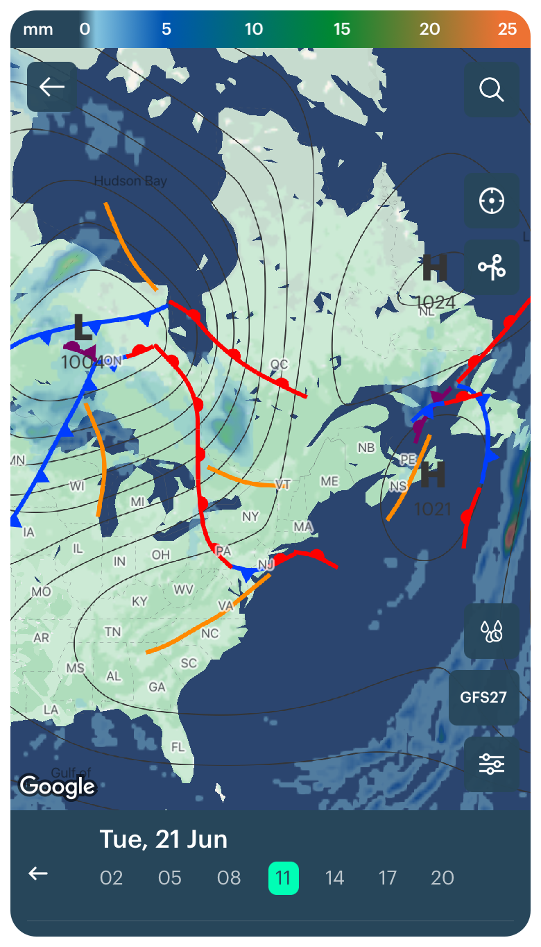
Weather fronts map in the Windy.app for iOS
Learn more about how to read a weather front map
Live isobars map (atmospheric pressure)
The map with continuous lines that curve at different angles and form rings. These are called isobars.
Isobars are a type of isolines, lines that are used to show areas with the same values on a flat map for different weather and other parameters — wind, temperature (for this used isotherms), and, for example, atmospheric pressure. Isobars show just that. That is, there will be the same pressure along the entire length of the line on the map.
The isobars map also shows areas with different atmospheric pressure. You see the big letters L and H "scattered" around the globe. The L is an area of low atmospheric pressure or cyclone. In general, a cyclone means windy and rainy weather. H is a high atmospheric pressure zone or anticyclone. Generally, an anticyclone means sunny and windless weather. Learn more about understanding cyclones and anticyclones in this article.
Isobars are needed not only to know the pressure but also to better understand what kind of wind it is now and where it is blowing. For example, lines closer together accurately mean stronger winds than more distant lines.
Learn more about how to read isobars map

Isobars (atmospheric pressure) map in the Windy.app for iOS
Live swell map
The map shows a swell forecast, major weather, and natural parameters for surfing. It is a series of waves caused by special weather conditions in the ocean, such as a storm. Swell is really very important in surfing: No good swell — no good surf. A swell has several parameters: height, period, and the direction you see on the map.
The white arrows, like the ones we see on the wind map, show the direction of the swell. Look at the sharp end of the arrow to see where the waves are going.
Learn more about how to read a swell map

Swell map in the Windy.app for iOS
Live hurricane map
The hurricane map shows in real time where hurricanes, typhoons, and other types of storms are currently occurring. Each hurricane or typhoon is accompanied by strong gusty winds and heavy rains that can cause serious damage.
To identify an area with a hurricane, open the same Weather Map using the Wind Speed, Wind Gusts, and Precipitation layers. Areas with maximum wind speeds of 10, 11, and 12 on the Beaufort scale will be lilac and purple with wind speeds of more than 24 m/s, and the areas with heavy precipitation will be dark blue to dark orange, which is more than 5 mm per hour.
Learn more about how to read hurricane map.
Hurricanes weather map in the Windy.app for iOS
Live weather stations map
This map contains more than 30,000 (out of a total of 40,000) weather stations around the world. Weather stations are the main source of weather information on par with satellites, weather buoys at sea, and others. From the weather information, you get real-time information.
There are two layers on the map — one with icons of weather stations. If you click on an icon, you will see the wind forecast from that station. To get the hourly forecast for the whole day, go to the station screen.
The second layer is the live weather station map. Activate it to immediately see wind information from each specific station. The color of the arrow indicates wind speed and its direction indicates wind direction.
Learn more about how to read a weather station map

Weather stations map in the Windy.app for iOS
Where to get a weather map in the Windy.app?
In Windy.app, the weather map is called Wind Map. It is located right on the Home screen of the app. You can also always access the map from any spot screen by clicking on the icon at the top of the screen.

Wind map on the Home screen of the Windy.app for iOS
But that's not all the maps the Windy.app team is making for you:
In our second weather app WindHub, designed especially for sailors, you can find almost all the same maps that you can have in the Windy.app, namely: wind map, swell map, precipitation map, live weather station map, and others.
Weather map in the WindHub weather app for iOS
Text: Ivan Kuznetsov, an outdoor journalist, editor, and writer from the Dolomites, Italy, and Karelia, Finland, with eight years of professional experience. His favorite sports are road cycling, hiking, and backpacking, climbing via ferratas, and sauna Read his other articles
Cover photo: Brad Pearson / Unsplash
You will also find useful
How to read contour lines on weather maps
How to read the latitude and longitude of your outdoor spot
Latest News
Professional Weather App
Get a detailed online 10 day weather forecast, live worldwide wind map and local weather reports from the most accurate weather models.
Compare spot conditions, ask locals in the app chat, discover meteo lessons, and share your experience in our Windy.app Community.
Be sure with Windy.app.